
Project Overview
This app idea was born through a conversation my teammates and I had about our love for DIY projects. We all expressed our frustration with current platforms and creators lack of and/or inconsistent instruction format. We wondered… What if there was an app that was specifically dedicated those who were seeking projects and effective instructions.
Timeline:
Two weeks
My Role:
Research and Design
Define
Research
Ideate
Design
Test & Iterate
Tools used:
Figma, Optimal Workshop, Google suites, zoom.
Process

The Problem
The DIY community has a large variety of resources for project inspiration, however, these methods often leave users with a lack of clarity on project requirements including step-by-step instructions, needed materials, and a community. This causes users to feel frustrated, unmotivated to start a project, and ready to abandon projects
The Solution
Uncover ways to provide DIYers with a user-generated-content forum for DIY project inspiration, discussion, clear instructions, and tracking in a social app.

Define
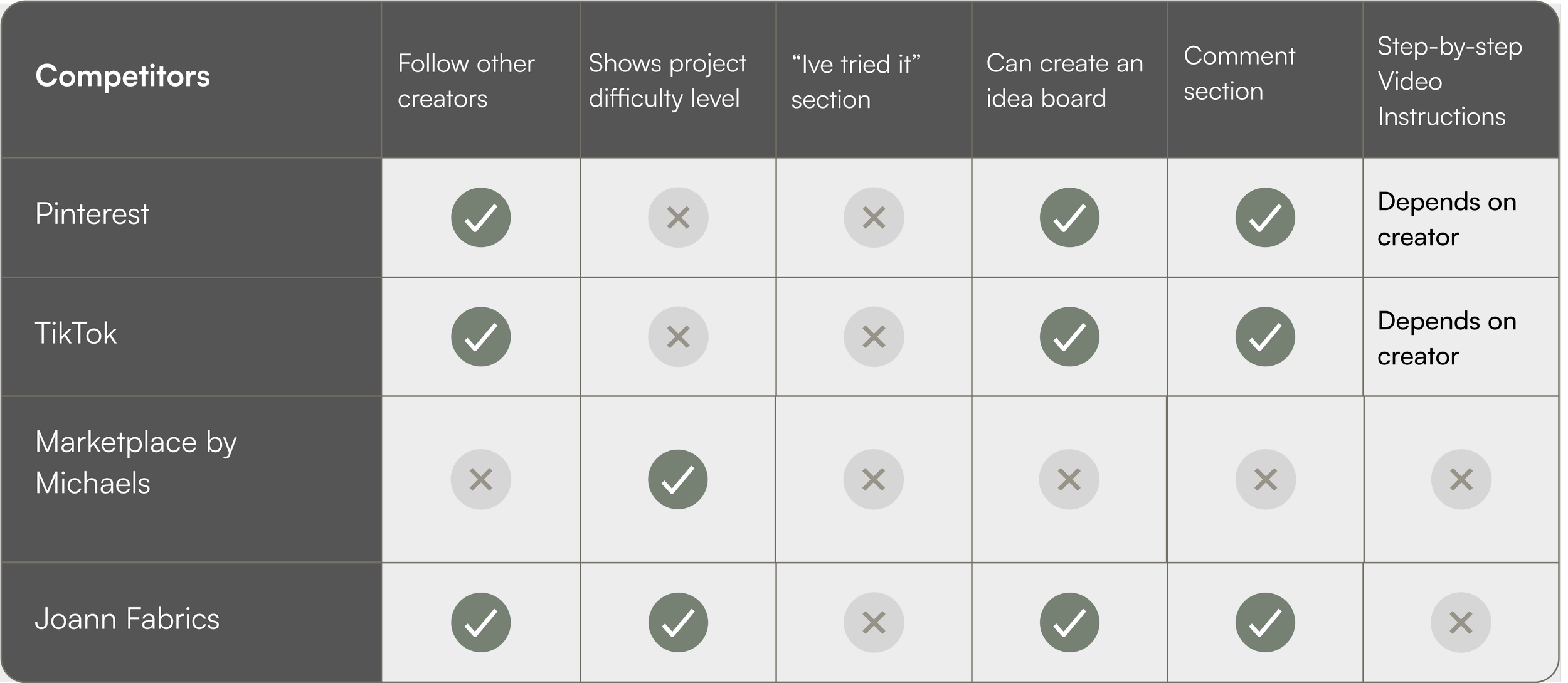
Competitor Analysis
After personally using the above apps and browsers, we identified the major challenges. Additionally we used google reviews and feedback from user interviews to construct a synopsis on the few apps that users mentioned.
KEY FINDINGS:
Competitors did NOT offer a set format on how instructions were displayed (i.e.) TikTok instructions often depend on creators to make tutorials in their short videos, and on Pinterest, instructions are often posted as external links instead of in the app. This makes it difficult for users to expect instructions in one central location.
Competitors had no specific “I Tried it” Section to showcase DIYs that users have

User Persona
Research
Survey
We wanted to identify the criteria required for a positive user experience
RESULTS:


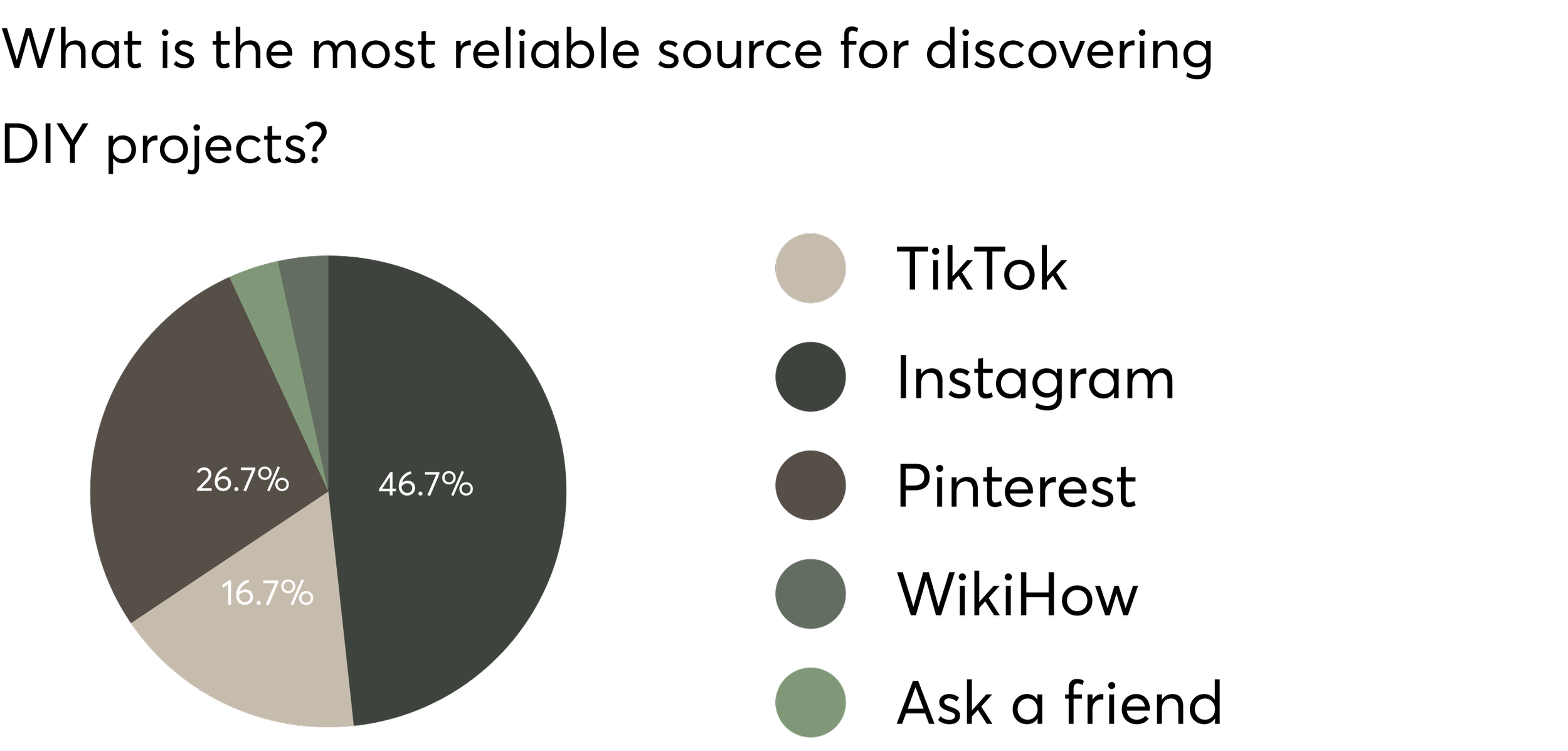
Preferred instruction format = short video
Instagram is the most reliable platform, second most reliable is Pinterest
Materials and instructions were most important to review before beginning a project
User Interviews
In addition to surveying, we interviewed 5 users. We organized our interview notes into an affinity diagram to identify common themes.
Research objectives:
Understand what triggers users to begin looking for a DIY project
Understand what people are looking for before deciding to participate in DIY project
Understand emotions and attitudes of users while following along with a DIY project

Common themes identified in interviews :

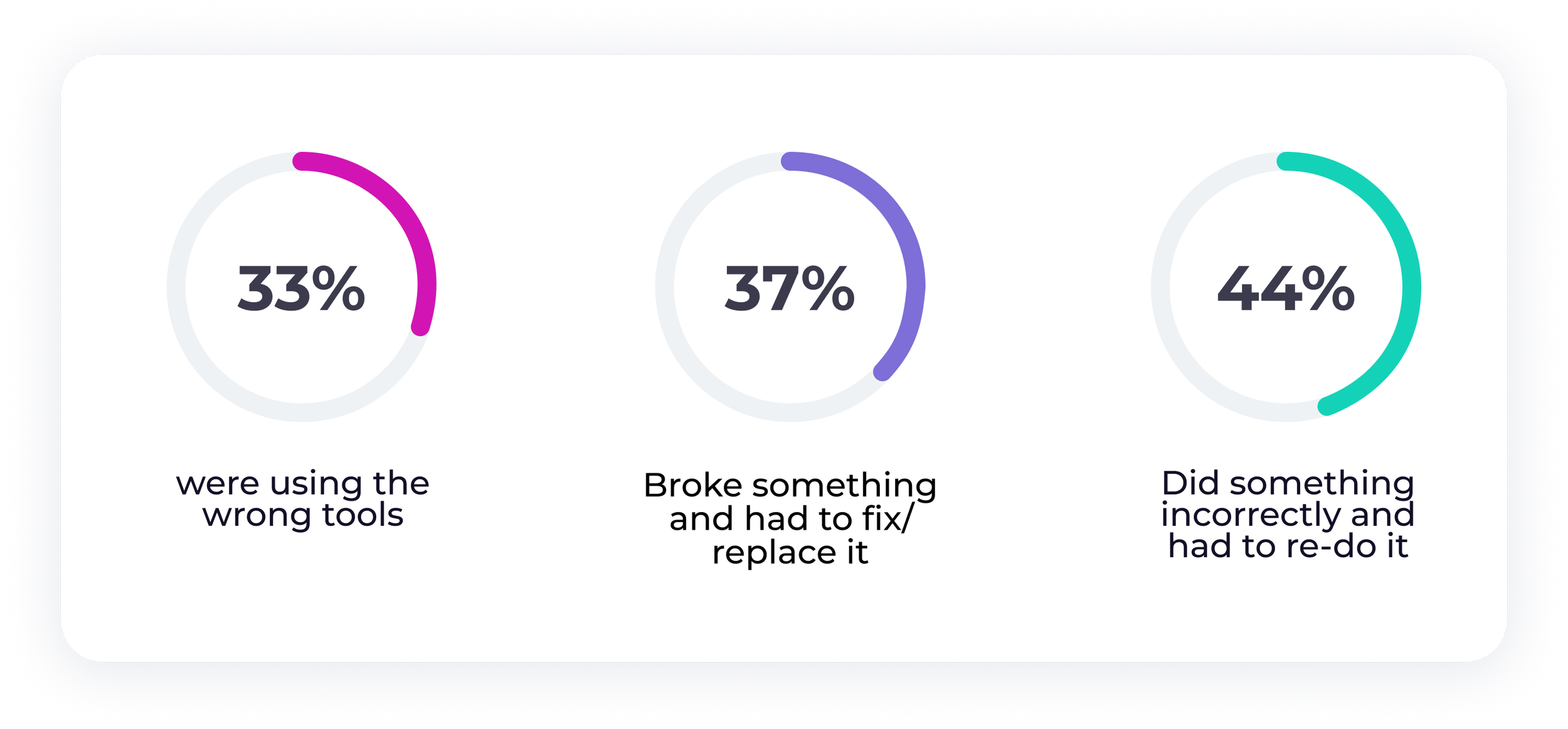
BIGGEST problems users reported facing during DIY projects……..
IDEATE
Feature Prioritization
Once we gathered insight from interviews and surveys, we began to brainstorm ways in which we could implement solutions to these findings into our app using a feature prioritization map.

Project Mode
User determined project skill level
Provide links to material/tools used
High priority:
Low priority
Allow users to schedule project reminders for specific dates
Hands free mode
User Flow
We then translated our storyboard into a user flow to magnify what the users interaction would be with the interface.

DESIGN
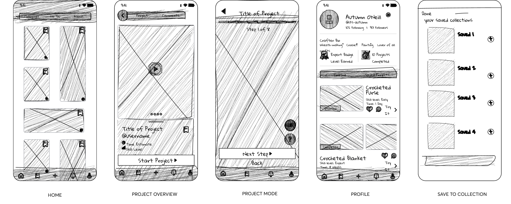
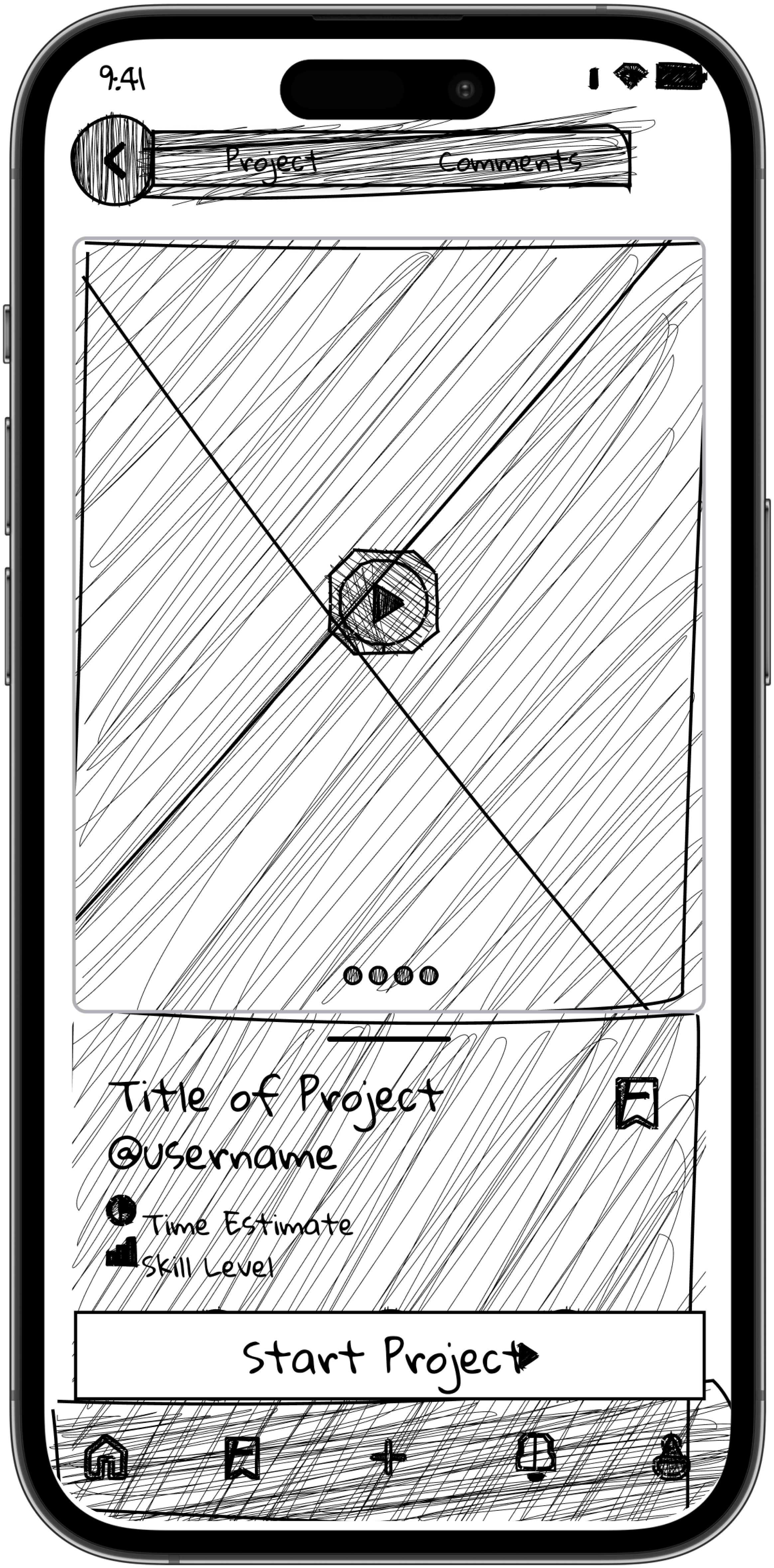
Sketches
We then translated the user flow into screen by screen wireframes to visualize what the app would look like.

Mid-Fidelity Wireframes
Style Guide
A simple but elevated color palette of Olive green and neutral sand to craft an inviting and authentic tone that leaves plenty of space for a wide range of user generated content. In color theory, green signifies abundance, new beginnings, and growth which we strive to provide for our users.
Calm | Clean | Inviting
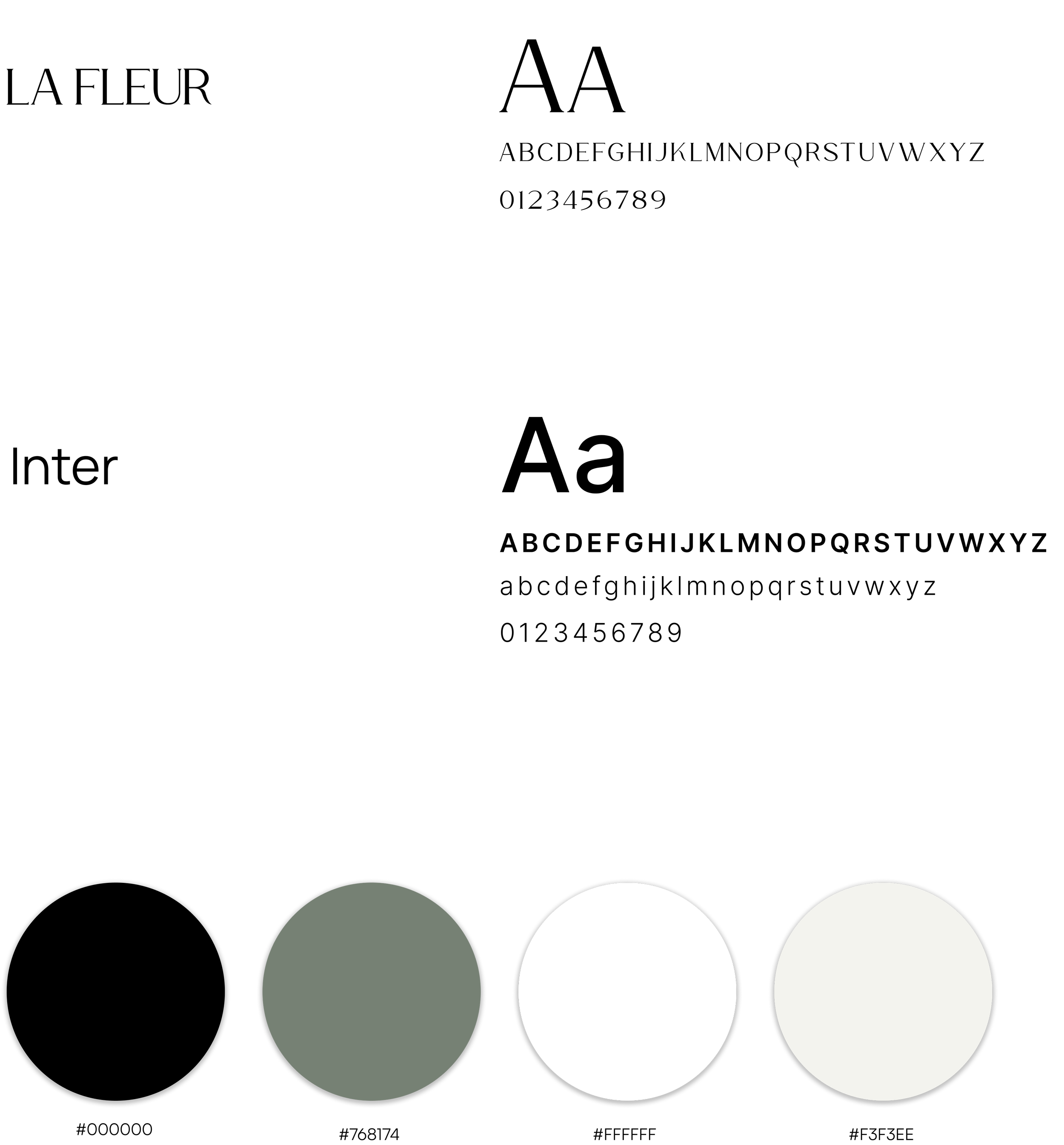
Typography
Colors
TEST
Usability Test/Iterations
Before we moved to digital wireframes, we wanted to see how users interacted with the our initial version. User testing provided us with the insight and feedback we needed to implement in our mid-fidelity version.
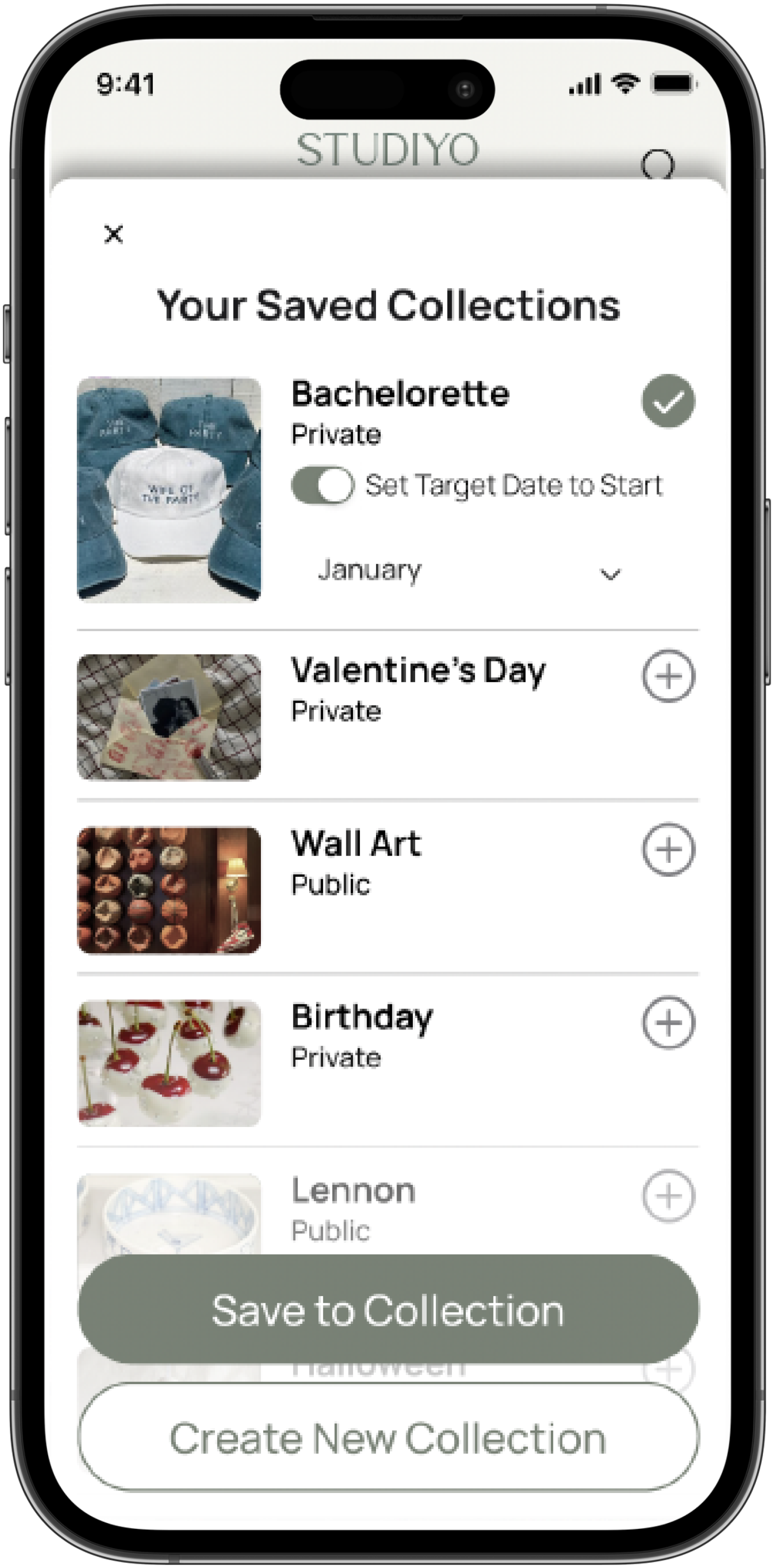
Task: Save a project
Success rate: 52% with prolonged task time
Success rate: 100%


Success rate: 100% with decreased task time
Success rate: 80% with prolonged task time
Problem: User control and freedom
Users intuitively clicked on “create new saved collection” with the intention of exiting the pop-up and felt lost/trapped when they were navigated to create a new collection pop-up.
Solution :
- We added an x in the top left of the pop-up to provide users with a clearly marked emergency exit incase of accidental navigation
- We added a “save to collection” button where users were intuitively navigating to originally.
Task: Project Overview
Problem: Hierarchy issue
Users didn’t intuitively know where to find the detailed project information and pre maturely “started” the project when attempting to simply learn more.
Solution:
1. Create more white space for visual clarity
2. Add a preview of information card
3. Remove unnecessary info, like, username, to prioritize space for crucial info.
App Features
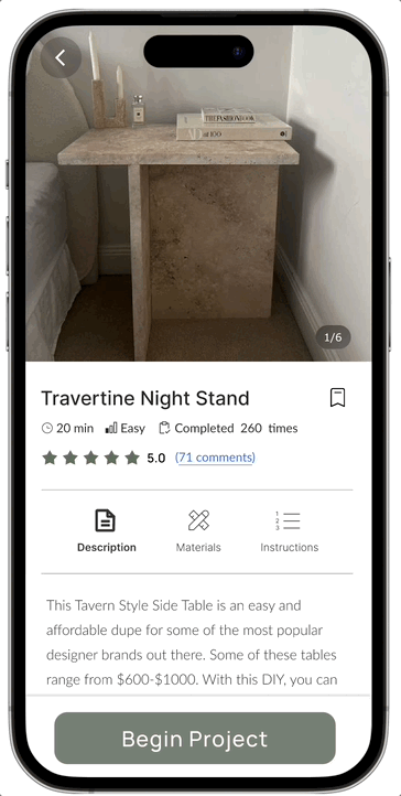
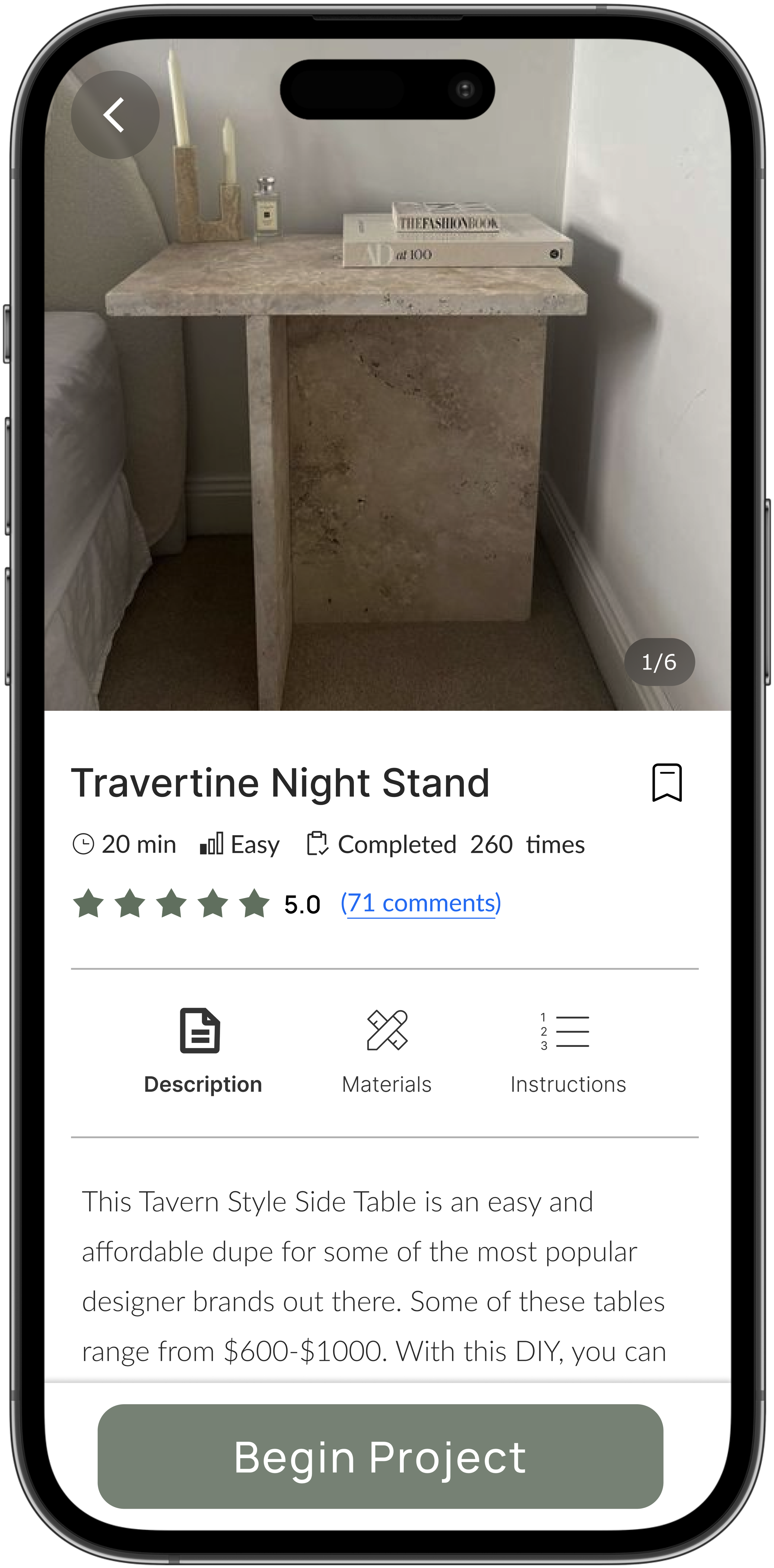
Project cards appear once user selects a project from their home feed they are interested in learning about. This screen displays the three most important things users reported needing to know before deciding whether or not they would like to pursue a project.
Project Preview
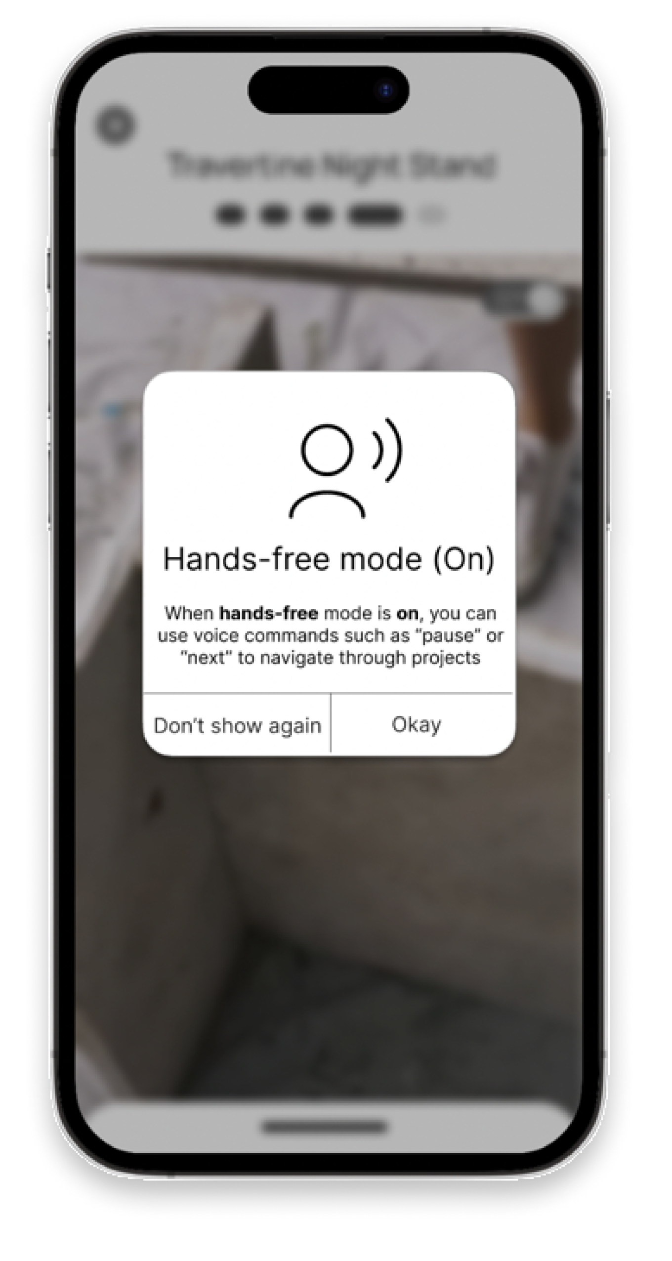
Hands free mode offers users the option to interact with step by step instructions using their voice. This feature was inspired by the fact that our users will be engaging in a wide variety of crafts and may not always have their hands available to physically interact with the app. A toggle is provided for quick access.
Hands-Free mode

Optional Survey
Users are given the option to answer a 2 question survey after completing a project. This helps the app collect data to generate accurate project duration and obtain user feedback on instruction clarity

Profiles are intended to keep users on track with their completed and ongoing projects, as well as add a social component to the app. Users can view each others profiles to see what their friends thought about projects and view photos of their completed work. They can also like and comment.
User Profile
Set Project Reminders
Researched revealed that one reason users did not complete DIY projects they previously saved was because they forgot they ever even saved them.
We added a feature so that users could save a project to their bucket list and set the app to remind them once the desired completion month arrives.
For example: It’s June but you find a cute Christmas project. You save the project and set the app to remind you in December to begin the project.
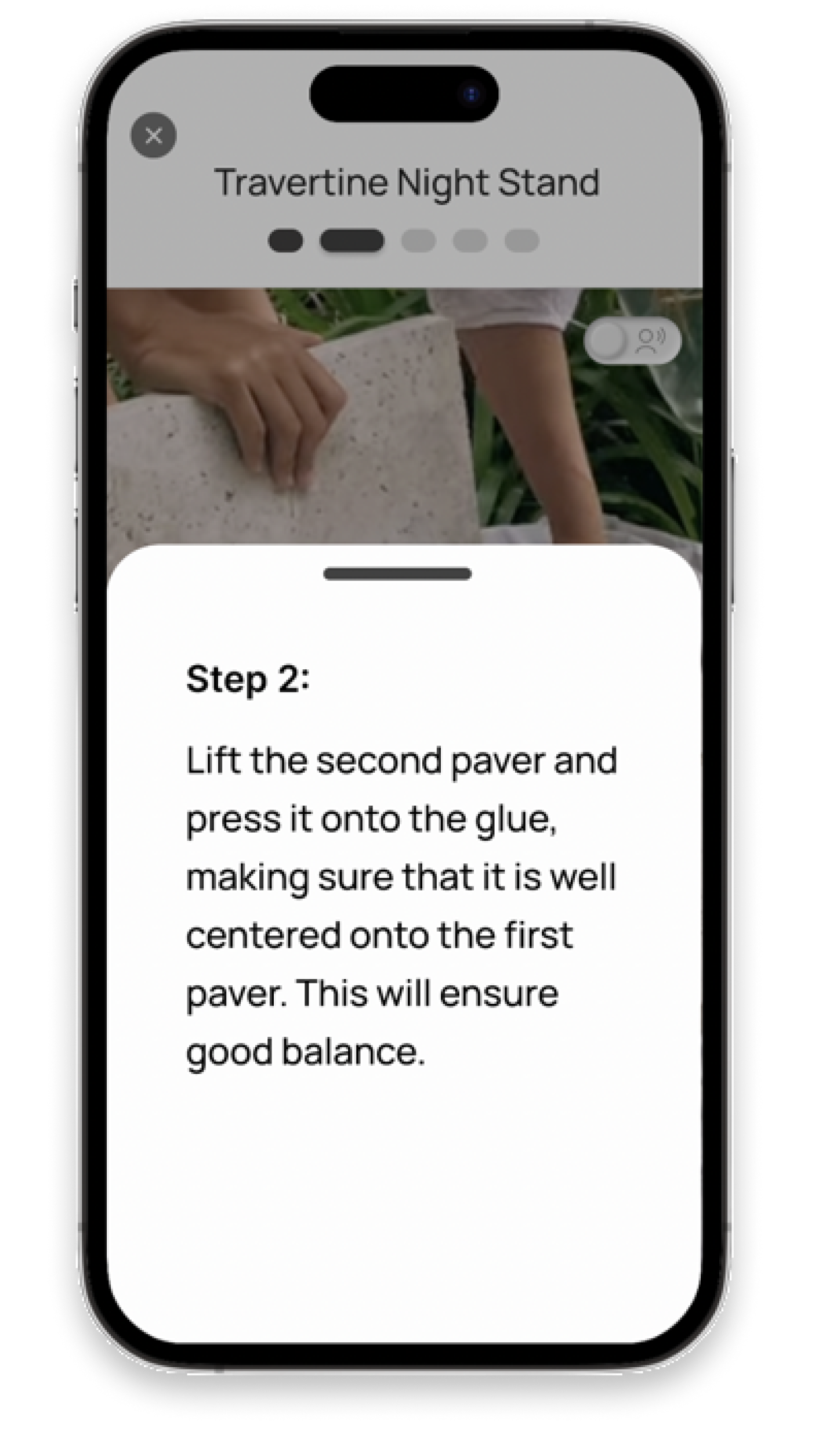
Each video step is paired with a with written instructions pop up card that corresponds to each step. This is to reduce cognitive overload and provide users with the two most effective instruction formats (reported by users).
Project Mode

Comment Section
Comment sections are housed within every project card. This offers users the ability to review other users’ experiences before deciding whether they want to follow along with a particular project.
MOCKUPS


PROTOTYPE
Reflection/Conclusion
Challenges:
Short timeline and additional coding portion
During this two week project, our deliverables included not only UX/UI but also, presenting a coded portion to the class. Considering the short time frame we had, and having just learned HTML, CSS, and javascript, we had to implement strategic project management and split the work load amongst group member in a way that would allow for us to complete each portion with quality work.