
Project Overview
This was our first project completed during a 6- month intensive UX program with Northwestern University. As my group pondered different app ideas, we arrived at one that would solve an issue we all shared: we wanted to play a more active role in our own lives, whether that be engaging in solo or group activities - but we were unimpressed with what current event sites had to offer us- their recommendations were basic, redundant, and irrelevant to our interests, so we created SPOT- an app designed to connect users with quality events and activities by actually getting to know users through a holistic lens.
Timeline:
Five weeks
My Role:
Research and Design
Define
Research
Ideate
Design
Test & Iterate
Tools used:
Figma, Optimal Workshop, Google suites, zoom.
Process

The Problem
Currently available apps present users with an infinite number of events and activities to sort through, based on location, popularity and trendiness—failing to align the results to a holistic view of who the user is.
The Solution
Uncover which features are crucial in the process of finding quality local events. Ultimately, designing an app that will help connect users with events and activities that align with their personal interests.
DEFINE
Competitor Analysis
After personally using the above apps and browsers, we identified the major challenges. Additionally we used google reviews and feedback from user interviews to construct a synopsis on the few apps that users mentioned.
Library of event options were irrelevant to the users personal interests
Too many options to choose from and manually filter through
Some competitors are domain specific (i.e. only cuisine/restaurants)
Events have been falsely advertised, leading to user dissatisfaction.
Competitors do not provide users with opportunity to customize their personal interests and moods
Competitors do not offer a way for users to evaluate events based off of mutual attendees
UI is congested and chaotic

User Persona
RESEARCH
Survey
We sought to determine whether or not our negative experience with finding quality events was unique to us. In order to do so, we collected data through user interviews and surveys.


Key Findings:
What does this mean?
This tells us that despite majority of users turning to instagram, word of mouth was actually the most reliable. SO…. if word of mouth is most reliable, then why is instagram being utilized more? This posed the following questions…
What made word of mouth recommendations so reliable?
Why are majority of users turning to instagram if so few of them find it reliable?
How can we translates its characteristics into an app feature so that word of mouth recommendations could be just as accessible as instagram?
Interviews
In addition to surveying, we interviewed 5 users. We organized our interview notes into an affinity diagram to identify common themes.

Users did not have a reliable way to learn about what to expect from new events and were often mislead by false advertisement.
Users were more inclined to attend an event if someone they knew, or they themselves had previously attended.
Users find the process of filtering out uninteresting events tedious and overwhelming.
Key Findings:
IDEATE
Feature Prioritization
Once we gathered insight from interviews and surveys, we began to brainstorm ways in which we could implement solutions to these findings into our app using the MOSCOW method. Most of our feature ideas were intended to solve the following issues:
Combat users falling victim to false advertisement
Decrease user overwhelm
recreate word-of-mouth like recommendations

User Flow
We then translated our storyboard into a user flow to magnify what the users interaction would be with the interface.

DESIGN
Wireframe Evolution
We then translated the user flow into screen by screen wireframes to visualize what the app would look like.

Style Guide
Now that we implemented user feedback from usability testing, we were ready to begin imagining a style guide that would convey the intended brand identity. We chose a color palette with variations of purples. In color psychology, Purple is associated with luxury, royalty, and ambition. We wanted our users to feel special and prioritized. All the while, curating a luxurious and personalized experience.
Luxurious | Sophisticated | Clean

Typography
Colors
TEST & ITERATE
Usability Test
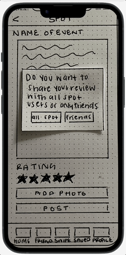
Before we moved to digital wireframes, we wanted to see how users interacted with our paper prototype. User testing provided us with the insight and feedback we needed to implement in our mid-fidelity version.

Success rate: 82%

Success rate: 71%

Success rate: 97%
Task: Save to bucket list

Success rate: 100%
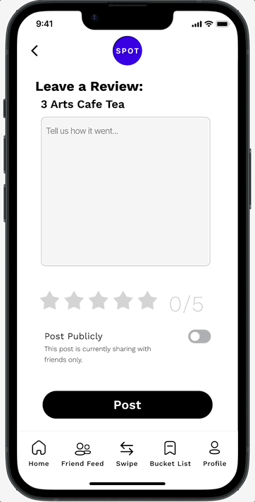
Task: Leave a review
Average Task Time: 7.2 seconds
Average Task Time: 5.3 seconds
Problem: Unnecessary Navigation
These two pop-ups delayed user task time, distracted them from the goal of posting a review, and cause unnecessary navigation
Solution :
- A toggle in place of a pop-up aims to reduce cognitive load by limiting the number of screens the user has to clear before posting a review.
- A banner confirms a posted review and disappears after a delay to continue to reduce the amount of screens user had to exit out of.
Task: Create new bucket list
Bonus: A “Collaborative List” toggle added social interaction to bucket lists.
Problem 1: Distracting UI
When tasked with saving an event to a new bucket list, users paused to pan over these “pre-existing” bucket lists.
Solution 1 :
Pre existing bucket lists were hidden to prevent user distraction
Problem 2: Hierarchy Issue
The “Create New Bucket List” button was the target of the task, but its placement at the bottom was not calling attention.
Solution 2:
Moving the “Create List” button higher directs navigation more effectively.
Problem: Icon Confusion
User testing revealed varying interpretations of the heart button, the term “save,” and our “bucket list” feature.
Solution :
- Changing the heart to a banner aims to clearly communicate “save” functions, and it is familiar across multiple platforms.
- Changed “Save” to “Bucket List” in the navigation bar to consolidate bucket list/save/”heart” labels and functions.
App Features

Survey
Event library is curated based on preliminary survey. These questions aid in understanding a holistic view of the users interests, personality, and preferences, mimicking the way a best friend would know you.

Event Library
Event library consists of spots curated based on users preliminary survey, friend recommendations, and upcoming events.

Event Card
Event cards house important event information, descriptions, and links. AND shows the user which of their friends will be attending the event.

Reviews
Research revealed: Users are more likely to attend an event if they, or someone they know has previously attended.
Users have access to photo reviews by public and friends, as well as the ability to leave a review themselves.
This helps to combat false advertisement users expressed falling victim to on other platforms.
Prototype
Reflection/Conclusion
Future Explorations:
With more time and continued iteration, the following features would be added:
Adjustable personal preferences
Syncing contacts
Timely event/activity notifications
Develop additional navigation bar pages including friend feed, swipe left/right, bucket list, and user profiles
Challenges:
Underestimating the amount of time it would take to accomplish all that we set out to do.
Our excitement sometimes cause us to bite off more than we could chew, and in a few instances, we had to back pedal and reevaluate our project scope and reprioritize which features and methods we wanted to move forward with.