
Project Overview
Buying pets from breeders is more popular than adopting because… people have a larger selection when buying from a breeder compared to adopting from a shelter.
Now shelters can offer just as much of a selection as breeders do thanks to pet transportation services. Rescue Riders partners with animal shelters across the U.S. to transport adopted pets to their new homes. Pet owners are no longer confined to shelters near them and have hundreds of shelters to search for their favorite breed.
Timeline:
Three weeks
My Role:
Research and Design
Tools used:
Figma, Optimal Workshop, Google suites, zoom.
Process
Define
Research
Ideate
Design
Test & Iterate
The Problem
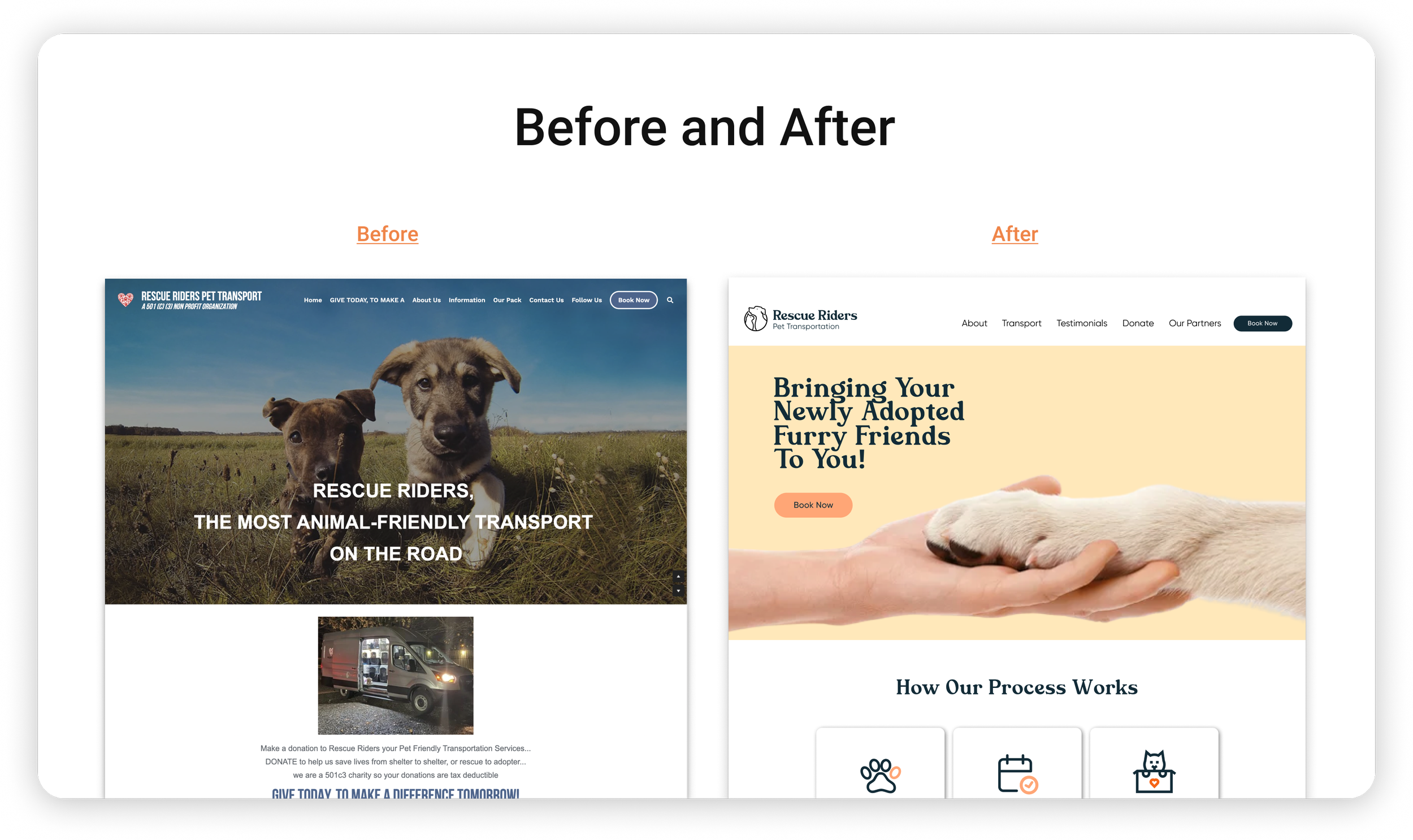
The Rescue Riders’ current website lacks a straightforward navigation system, fails to adequately communicate or explain their services clearly, and does not convey reliability and trust to their users. This deters potential users from taking advantage of transportation services, limiting their adoption range and denying many pets a second-chance at finding a forever home.
The Solution
Redesign Rescue Riders’ website so that future-pet owners have a clear understanding of how their process works, trust their services, and are able to successfully book transportation without confusion.
Competitor Analysis
After personally using the above apps and browsers, we identified the major challenges. Additionally we used google reviews and feedback from user interviews to construct a synopsis on the few apps that users mentioned.


User Persona
Heuristic Evaluation
We conducted a heuristic evaluation on the original website. This helped us analyze and dissect each page in order to identify accessibility and stylistic issues and recommend solutions.
Homepage

Donate Section
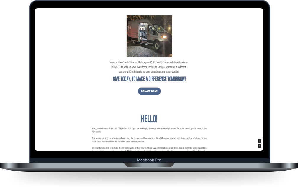
1. Donate section should standout
The donation section is word heavy and does not draw the users in with sufficient hierarchy. This is a great place to have interesting and potentially interactive features that engage users and increase donations
2. Donations should feel transparent with user control/freedom
Users should have clarity and understanding on where their donations are going and how they are being used. This will help users to feel that they are free in their choices
Transportation Section

1. Express Rescue Riders’ services more accurately
Consider a photo that represents their services more accurately and/or a description that educates the user right away as to what their services are. Assumption could be made that RR picks up animals in danger off the road like animal control. Make it obvious that they transport your adopted pet to you
2. Consider separate pages for each nav tab.
Consider separating different sections into different pages to allow a more thorough content for each section.
1. Make clickable content obvious
The information on this screen is only clickable if you select the photo. There is no hover animation to indicate that they are clickable either. Consider adding a “Learn More” button or something to indicate that this content is clickable so that users are not deterred from exploring important information on the website.
2. Photos should be placed over a plain background
Increase amount of white space in this particular frame. Having photos on top of photos becomes distracting to the user. Consider a plain background or frames for each content group
3. Make titles more accurate to what button is linking to
Transport information button leads to the transportation schedule. Consider adjusting the title or swapping of the title
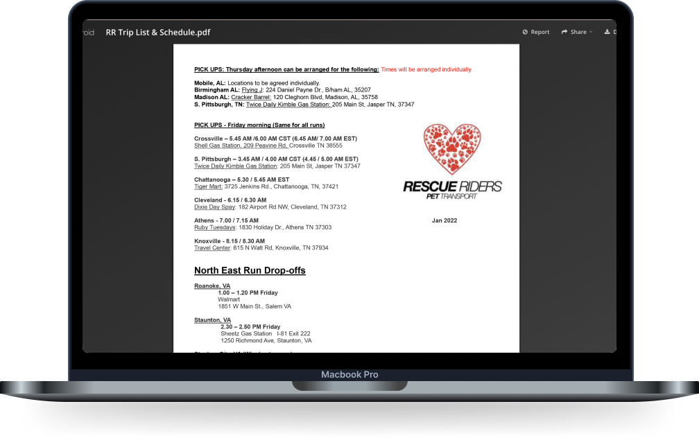
4. Content should be HTML instead of pdf
Buttons in this section should navigate to webpages NOT PDF’s.
Having the information on a webpage instead of PDF’s will will aid accessibility for those who are visually impaired and use their computer to read the text aloud AND increase SEO.

RESEARCH
Usability Test
Data was obtained through usability testing on the original site.

Affinity Diagram
In addition to usability testing the original site, we interviewed 5 users to get an idea of what would make a good website and earn user trust. We organized our interview notes into an affinity diagram to identify common themes.
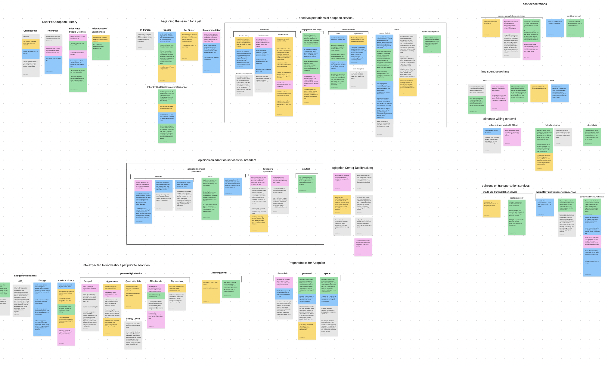
Key Findings:
Reviews, word-of-mouth, and the quality of a website revealed to be most influential in crafting users’ trust in a pet transportation service.
Users reported credibility, consistent communication, and value alignment as their primary needs in choosing a transport service.
IDEATE
Feature Prioritization
Once we gathered insight from interviews and surveys, we began to brainstorm feature ideas using the “I like, I wish, What if” method.
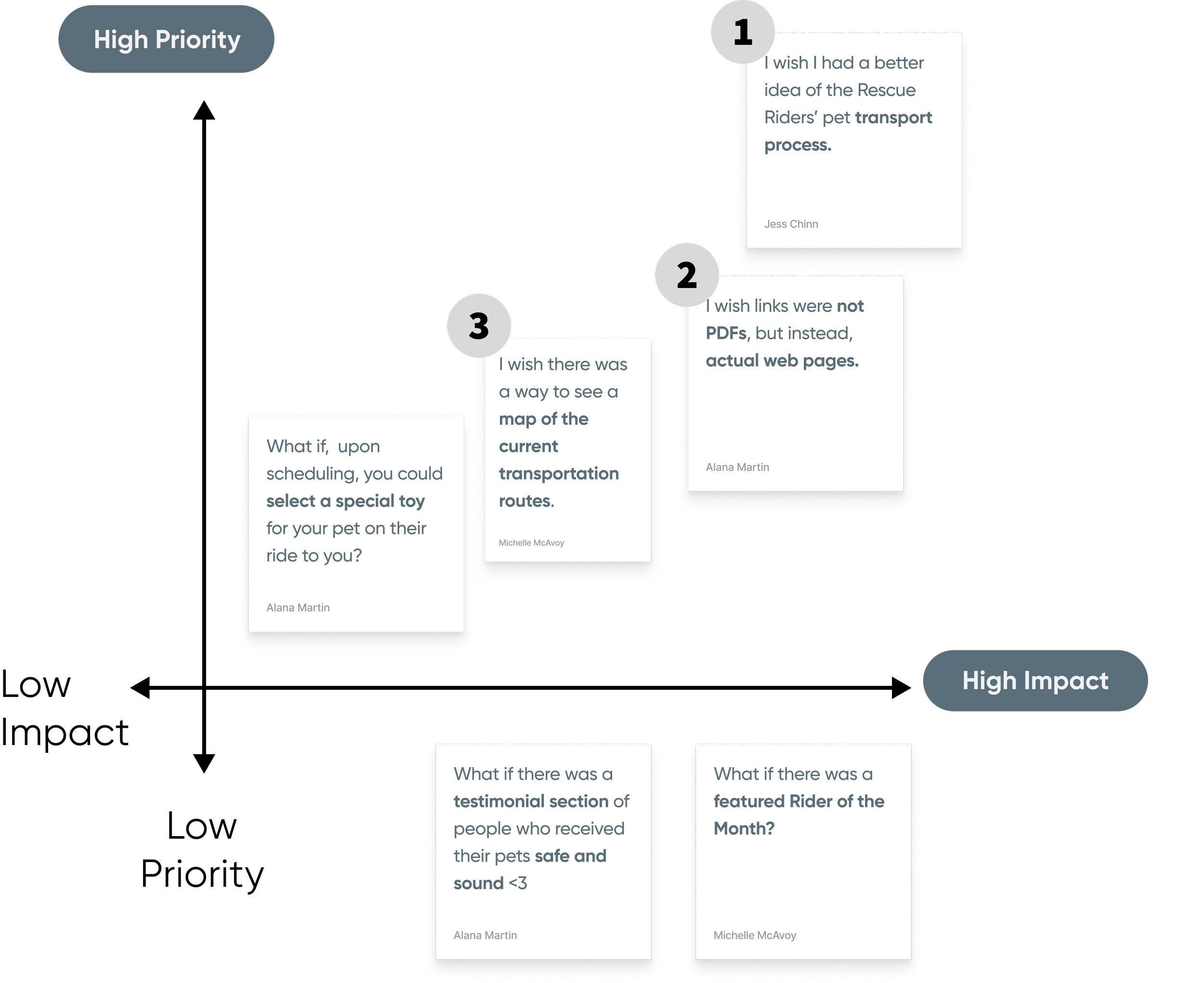
Feature priorities:
Clarify logistics of the transportation process
Add visual reference for transportation locations
Convert PDF links into web pages
Information Architecture
We organized our ideas and sorted the main features and content through a sitemap. This helped to establish a high level overview of the new information architecture.

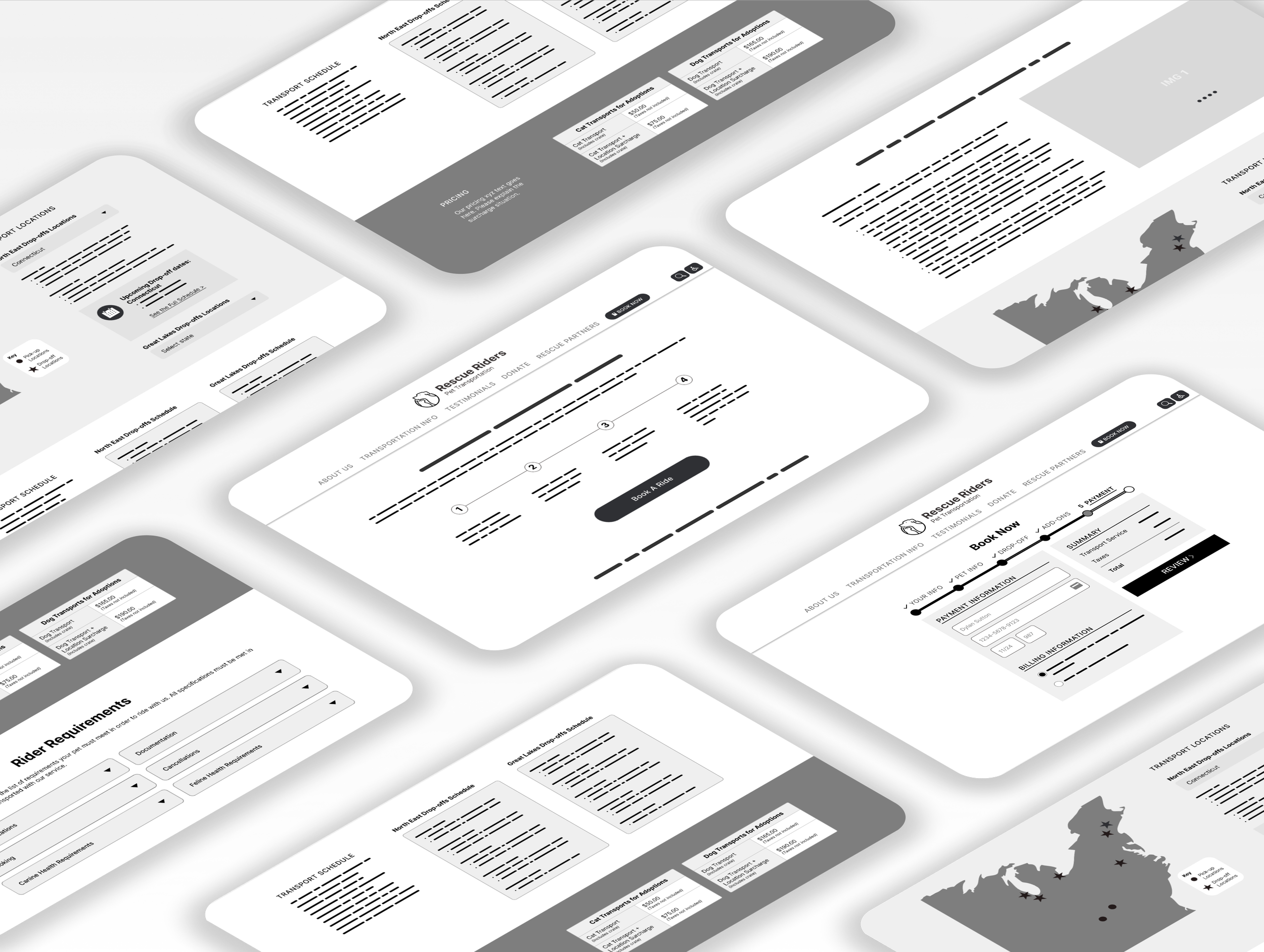
Wireframes
We then implemented our new information architecture through digital wireframes to visualize how we wanted the new interface to look.
DESIGN
Style Guide
Now that we implemented user feedback from usability testing, we were ready to begin imagining a style guide that would convey Rescue Riders identity. We utilized the working of color psychology by introducing a powdery orange and pale yellow as our primary colors to convey fun, friendliness, and warmth. Secondary colors were chosen as a powder baby blue and navy blue to convey freedom.
Playful | Trustworthy | Safe

Typography
Color
TEST & ITERATE
Usability Test/Iterations
Before we moved to Hi-fidelity wireframing, we wanted to see how users interacted with the our lo-fi version. User testing provided us with the insight and feedback we needed to accomplish intuitive design in the next phase.


Transportation Screen
Problem:Users expected to see transportation locations right away when they clicked on the “Transportation Info” label
Solution : Edit the hierarchy of the page so that transportation location is closer to the top of the page for users to come across sooner
Hamburger Menu
Problem: Mobile users had trouble finding the book now button because it was tucked away in the hamburger menu
Solution : Add an additional button to the homepage in the second iteration and enlarge “Book Now” button in hamburger menu
Book Now
Problem 2: Book Now was hidden in the menu bar and users wanted visual access to the button right away
Solution 2: Add Book Now button on homepage for quick and easy accessibility
Implementing feedback

Testimonials
Testimonials and reviews
Testimonials provided by 3 types of users to demonstrate the brands credibility amongst all clients.
Preview of google reviews from clients.
Rider of the month:
This feature will help foster a sense of trust and care between the organization and user, as it pays homage to the little things
Real time updates:
Once user has booked a ride with Rescue Riders, they have the option to opt-in to real time updates from their pet throughout transportation.


Homepage
Navigation tabs reflect content more accurately
Preview of “How Our Process Works” displayed on at the top of homepage, giving user freedom to learn more. (research revealed this to be one of the most sought out sections upon entering the site).
Donate and Volunteer cards are displayed with more in depth description of what content entails, AND accurately representative phots are added as hook elements for better scanability.
Carrousel gallery of Rescue Rider partners is displayed on homepage to foster trust and credibility between user and organization.


Step-by-step process illustrated for comprehension
Information is HTML instead of PDF
Drop off location section offers interactive experience to help users navigate to users nearest drop off location.
Map is visible upon page entrance to reflect its importance
Filter feature added to drop off section for easer navigation
Conditions and care are visible on transportation screen rather than nested in a hyperlinked pdf
Requirements are nested into an according menu to reduce cognitive overload and improve scalability
Users are able to download a checklist to keep track of all the requirements
Transportation Page


Mockups


* embedded prototype may display UI animations differently than official version in Figma
Prototype
Reflection/Conclusion
Future Explorations:

Leveraging stakeholder input
We continue to have some open questions related to Rescue Rider’s operations, mission, and goals. Additionally, we would want to ensure that stakeholder feedback and priorities are understood for final prototype development and iteration.

Integrate with rescue partners
To make a more seamless process, we want to investigate how Rescue Riders could integrate with their rescue partners’ adoption processes by including pet profile pages, comprehensive information on rescue partners, and connecting between the websites.

Create personal profile
We would like to consider developing a profile creation step alongside booking the transport so users can return to booking information, easily communicate with Rescue Riders, and reduce the “transactional” feeling of the current book now process.